Friday, March 30, 2012

PDCC125 - Jane Davies Inspired

This week's Play Date Cafe Challenge (PDCC125) is to use Black/White with a splash of Brown!!  Was there ever a challenge more "Michelle"??!!  It stated on the Play Date blog that, "it's the first time we've ever done another 'neutral' as our splash".  That may be very true for them but when I saw the challenge online I was sporting - wait for it - a shirt that was black/white with a splash of taupe!!  YUP - I'm fashionable that way!
Decided to get artsy with this challenge - very fancy materials were used in the construction of these two cards.  I'll wait for you to get a pen/paper to write down this extensive list:
Black India ink, brown acrylic paint and a straw - yes, a straw.  It becomes an invaluable tool in moving the India ink around your paper before it dries.
This isn't the first time I've used this technique - back in early February Kim and I had a waxy good time but I never got around to posting pics of what I worked on until now.
Jane Davies is a collage artist from Vermont who posted a great video on doing Ink Doodles.  These were my first attempt at trying my hand at it.
The first layer is a collage of torn patterned papers that are then covered with a layer of gesso to tone it down.   Then comes the fun - squirt some random ink on your paper and blow, blow, blow with that straw! Yes - it can give you a headache but the most wispy feathery marks are the ones that look the best to me despite the dizzy aftereffects!  Geometric shapes were added with watercolor paint and then
a layer of beeswax added more dimension that I spent a great deal of time buffing up with a soft cloth to get that fabulous gleam!  Definitely a fun technique to try!
Linking to:  Artists in Blogland - Show and Tell Saturday #22 and Balzer Designs - Art Journal Every Day

Friday, March 23, 2012

CFC45, PDCC124, FTL183 - Thinking of you

One card - three challenges!  That's the way I like to do it!!  
The CAS-ual Friday challenge is to use pastels and black together - sounds so easy but is tougher than I anticipated.  Next up is The Play Date Cafe Challenge and last is the Fall To Layout from Clean & Simple Stamping.
Swapped the circle in the layout for ovals that were stamped with the Cornish Heritage Art Nouveau backgrounder (retired) with A Muse Studio Papaya ink.  
A spritz of Blue Skies Glimmer Mist added the blue without being too overpowering.  The rounded corner and pink sparkly swallow help keep the card from being too "right heavy".
Other supplies - Swallow dies, Diamond glitter, Smile Inside stamp set, Bubblegum and Sky cardstock (all from A Muse Studio)

Thursday, March 22, 2012

Cleopaisley -

While drawing a girl a couple days back the thought struck me that a pattern in the hair would be cool -  paisley seems to be my "go to" pattern these days. . .
She looks faintly Egyptian to me - I was calling her Cleopatra when I realized that a better moniker for her would be "Cleopaisley" -
Linking to Balzer Designs - Art Journal Every Day: Getting Started

Monday, March 19, 2012

Art Journal - Wild Flowers

Here is something completely different for me - a free and wild flower journal page - painted on the night that I made this canvas - same color palette but a completely different look.  Frankly, all that color scares me a bit but the family consensus is that this one is the favorite of the two. . . well, except for the black paint up in the upper right hand corner.  I did that to add some black to that corner of the paper but mom thought that surely must have been a mistake (a paintbrush mishap, perhaps) and not something a person would do on purpose so . . .
here it is with the offending black cropped out.  Since it is painted on canvas paper I am debating whether or not to cut it up and use it for notebook covers.
Linking to - The Sketchbook Challenge - Flowers and Balzer Designs:Art Journal Every Day

Tuesday, March 13, 2012

Second Floor Challenge #1 - Gold Paint

It is no secret that I am a fan of Julie Fei-Fan Balzer - she is why I started my art journal.  Love how free she is with her art - Julie and Nathalie are starting the Second Floor Challenge which is a year-long opportunity to take your art up another level - "take it to the second floor".  
Today they posted their first challenge - use 
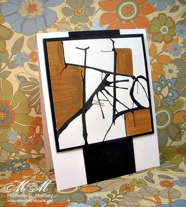
gold paint.  This challenge couldn't have come at a better time for me -  Last night I drew a CNG as a joke kinda aimed at my good friend, Kim, who is not a big fan of the CNG look (in case you are wondering CNG stands for what Kim calls Crooked Neck Girls).  When I was done I LOVED my CNG and decided that I wanted to put her on a canvas -
my initial impulse was to frame her in black - since that is what I tend to do.  But it was too harsh - so I sat her aside and walked away - Later I was on the computer and saw today's Second Floor Challenge and that was my solution!!  Gold Paint!!
I truly would never have thought to use gold paint but I love how it contrasts with the plain pencil sketch - adds a dimension that would never have happened with black paint!  The gold reflects while the black just kinda sucked the life out of it - BTW - Don't pick up your sketch with gold paint on your finger (OOPS).
"She WILL take it to the second floor."
That is my new motto and my canvas sits where I can see it while I craft.  
Thanks to Julie and Nathalie - can't wait to see what the next year brings with this incentive to push myself out of my comfort zone!

Sunday, March 11, 2012

"Simple Faces" - Sketchbook Delight II

Lesson 5 in Alisa Burke's Sketchbook Delight part 2 online class is Simple Faces.  My watercolored girl looks a bit serious but that is because she is busy thinking about whether she should have a snack or take a quick nap.  I know this because most late Sunday afternoons I sport this same face!  Usually the nap wins out first followed by a snack upon awakening.  I am a girl of simple tastes - - I joke that if there were awards for snacking/napping I would win a big, shiny, gold one!!
I think my girl is cute but what I really love is her gorgeous green paisley shirt.  Wish I had a shirt like that - LOVE that color green!  Linking to Artists in Blogland - Show & Tell Saturday #21.

Saturday, March 10, 2012

Art Journal - Doodled Flowers

Recently picked up some primed premium cotton canvas sheets.  Who knew that these things came in pads?  Not me but I don't know much about art supplies at all and nearly every time I am in the art aisles at Hobby Lobby something new pops out to catch my eye.  Let me just state that if a trip to Hobby Lobby with its limited art supplies overwhelms me you can just imagine what a trip to Blick's does to me - swoon!!  I have to go there with a list or we would easily go broke from me picking up "a few things that I need (want)".
I messed around painting some backgrounds the other night - this one was just a bunch of fun circles but later when I walked by the notion to doodle flowers in the circles was overwhelming!  I will admit that I totally swiped the far left flower from Alisa Burke but the rest are mine.   Linking up to The Sketchbook Challenge (March theme: flowers) and Art Journal Every Day - Julie Fei-Fan Balzer.

Thursday, March 8, 2012

PDCC122, OLW82: Swirly Fun

One Layer Wednesday and this week Susan has challenged us to use a Swirl on our one-layer card.  The colors are courtesy of the Play Date Cafe Challenge pictured below.
 My older son kindly pointed out that my card's swirls appear "more orange than yellow, mom".  AARRGGH - The ink is Squash from A Muse Studios and always appeared to be more of a mustard yellow than a mustard orange to me.
The swirl comes from the A Muse Studio Ornate Elements stamp set and it makes such an elegant frame for your sentiment when it is stamped twice.  While the swirl appears asymmetrical when stamped alone, once you turn it around and stamp it again the whole thing becomes aesthetically pleasing to the eye.
A tiny strip of Smokey Shadow fulfilled the color requirement for the PDCC but then disqualified for the OLW challenge.  No worries, this design is quick and easy to replicate!
Linked to 52 Card Pick Up - Week 10 and CAS-Fridays - For Sentimental Reasons.

Monday, March 5, 2012

LIM57 - Neutral Ginkgo

As a big lover of all things neutral (or as my mom puts it, "you like everything the color of dirt" -  is that a problem?) I could not let the Simply Less is More Challenge #57 pass me by.
Roni kindly let me use her Harvest Berry PTI stamp set (am I the only one that thinks this set was seriously misnamed - wouldn't Ginkgo Leaves have been a better name?) and I have big plans to make lots of cards for my MIL and SIL as gifts when we visit them in April.  No matter what color you stamp them in they are gorgeous!!  Sentiment is retired A Muse Artstamps.

Saturday, March 3, 2012

Pursuing Portraits - Lesson One

Yesterday's post featured some face outlines I was working on based on the Pam Carriker's Pursuing Portraits class.  I was excited to watch the rest of Lesson One to learn about shading.  LOOK at what I made last night and today!!
They are a bit serious looking but I would've never guessed that I had these girls hidden inside me!!  Plus, I had no clue that you could do pictures like this with only a pencil and a paper stump.  Adding the shading is fun and brings the features to life.
While the same techniques were used on each one they all turned out a bit different - maybe someday when I have more practice I can draw something that has a bit of continuity to it.
This girl has big eyes but reminds me the most of Pam Carriker's style.  Caleb said, "Maybe you should take a break from drawing, mom.  You've accomplished a lot in two days."

Friday, March 2, 2012

OLW82 - Cream, Black and Bling plus faces. . .

This week's One Layer Wednesday challenge is Cream, Black and Bling and retired products - Cornish Heritage Farms Backgrounders (Scalloped Tiles, Art Nouveau) and wood-mounted A Muse Artstamps sentiments.  BTW - I just made up the part about using retired products but feel free to if you want. . .
The bling comes from a strip of double-sided tape sprinkled with Martha Stewart Onyx glitter.  This combo makes a simple but elegant look. Guess what else I worked on?
I am taking Pam Carriker's Pursue Portraits class.  Funny, I never took an online class until last year but I've really been enjoying them lately.
I drew these faces after watching the first 8 minutes of Lesson One - I'm going to go watch more and learn about shading - WHOO HOO!  Can't wait to see what I can do after 6 lessons!!
In the past when I've tried to make faces the eyes were invariably too large and way too high on the face.  Good to finally learn the rules of symmetry for face drawing - maybe with practice, I will one day produce something that looks like a  real person. . .kinda sorta.