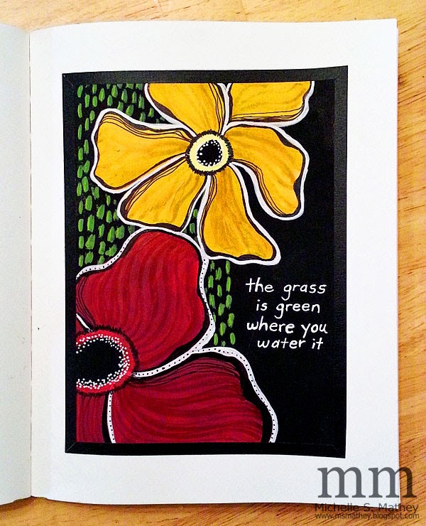
I'm thinking this would look so much better if I had some mad lettering skills - doncha think? Since my career as a calligrapher isn't going to start anytime soon I am wondering. . .do you have any tips for adding wording to your pages? I regularly use letter stickers and print out sayings that get cut/glued onto my pages but if you have any other ideas I'd love to hear them!!
Linking to Art Journal Every Day and


10 comments:
If you type up what you want to say and then hold your art against the computer screen - a little masking tape doesn't hurt - you can usually see well enough to trace the letters. A dim room helps. I do that pretty often.
I smile every time I see the title of your blog! Wonderful work!
I think your lettering looks just fine. I like the colors you chose to put together. Very nice piece. I would love it if you would like to link over on my site too.
http://thequeenofcreativity.blogspot.com/2015/01/express-your-creativity-week-2.html
Kate
I LOVE how those vibrant flowers pop off the black! I'm not so keen with my handwriting either so what I do sometimes is create my art and then add words digitally in photoshop. I keep a blank copy of my piece and one with the digital words so I can get either way printed into cards if I wish.
I love your page! If you want to learn some fun lettering I strongly recommend Joanne Sharpe's online class, "Letter Love".
Alphabet stamp sets! I am a bit addicted so I know you can get them in all sizes and styles. You can get tiny wood block sets from Michaels in the $1.50 area, which would be perfect for your art! I recommend a good stamping ink,like Ranger Archival inks, instead of the ones you can also pick up on the $1.50 area.
I love your lettering...it's a wonderful style of your own. Just like your artwork is! I don't like my lettering either I'm trying to change. You could get joanne sharpes book she has so many styles...also write on tissue paper and then glue that on...white tissue disappears into the artwork. Nice thing about it is you can move it around as you see fit. If you make a mistake it's more forgiving!
Hugs Giggles
Great color-combination on your beautiful work!!
Smiles, Saskia :)
Wonderful work! Love the composition! There's nothing wrong with your lettering skills I think. I never like how I've written something the first time, so I always go over it a second time and then it looks much better. Making the letters a bit thicker in some places, or adding some small lines can make a big difference. Try watching Teesha Moores video's on art journaling, she gives some great tips regarding lettering.
I love your page. As someone else said, you might want to check out Joanne Sharpe's Letter Love class. She encourages and helps you to find ways to looove your own handwriting. It's kind of hard to explain, but with a lot of play and practice you learn to exaggerate your own handwriting so it looks artful!
Post a Comment