Saturday, October 30, 2010

FTL114 - thanks

This card reminds me of spring!  The layout comes from Clean & Simple Stamping's FTL114 - The stamps and paper are from A Muse and the little bit of dimension comes from Liquid Pearls in the flower centers.  TIP:  If you have problems with Liquid Pearls looking "too pointy" when you first apply them try thumping the card from underneath and they will smooth right out.

Friday, October 29, 2010

GS#62 - Happy Thoughts of Fall

You ever see a sketch and just have to drop everything and use it - NOW!  Maybe not, but if you are a papercrafter and read my blog on purpose (not just cause you are nice, mom - but thanks!!) then you are probably a fan of sketches too.
I LOVE this week's sketch from the Get Sketchy blog - That is why I do sketch challenges - there is no way EVER that I would have come up with a layout like this one!
I used some trusty tools - my Marvy Uchida oval punches - I've had them for a LONG time and totally never told my husband how much they cost when I bought them 4 years ago - it was a really big splurge at that time but they have been worth the $$.  Basic Grey patterned paper; Hero Arts tree stamp; Martha Stewart Coarse Clear Glitter; Cosmo Cricket Tiny Type and Stampendous Luxurious Velvet Brown Brocade stickers. 
Isn't it cool how the tree stamp fits in the oval so perfectly - I should make several cards with this tree and punch but right now I need to eat Egg Foo Young (how can something that looks so gross taste so great?)

Thursday, October 28, 2010

PDCC#53 - Splash of Burgundy

This card is based on the Play Date Cafe Colour Splash #53 (black/white and a splash of burgundy) and Skipping Stones Design Sketch #48. The patterned paper came from my La Creme pack, sentiment from A Muse, crystals from Prima and I made the flower. The JUGS #57 Wild Card Challenge this week is to make a burnt edge flower - try it - it is so fun!!
Yesterday it was 78 degrees here and today it didn't crack 60. Looks like fall is really here!!

Wednesday, October 27, 2010

OLW26 - What is black/white and red all over? Letterpress

This week's One Layer Wednesday Challenge is entitled - What's Black and White and Red all over?  Jennifer Styles is hosting the challenge on her blog and she made a super cool card!  My card's best feature is neither black/white nor red but is the embossed filigree.  I used my L Letterpress to emboss this shape that came with the kit.  I haven't had loads of success with the ink embossing but dry embossing is lovely!  I added red in the form of a sentiment from A Muse and the black is Onyx Martha Stewart glitter adhered with Scor Tape. This may be a very simple card but it has lots going on between the shimmer, texture and color.

Tuesday, October 26, 2010

CAS90 - Gingham and Checks

This card is for the Splitcoaststampers CAS90 Gingham and Checks Challenge. Our 8th Grade son went on an overnight band trip yesterday with dad as a chaperone. The controlled chaos at the school when I dropped my husband off couldn't help but make me be thankful for all the work that the teachers do (I was also very thankful that I am NOT a teacher)! This card also fits into Glenda's Random A Musing Challenge 88 - Pop Up your Sentiment! I cut the apple with my Slice; paper and sentiment are from A Muse.
What has your weather been like today? I spent some time in the hallway with the dog and the fish while the tornado sirens were going off - The field trip bus had to pull over to let everyone shelter in a hospital until the storm passed through - Can't wait for my family to be all together in one room again!

Monday, October 25, 2010

PDCC#52 - Play Date Cafe's One Year Anniversary!

I've been getting teased quite a bit recently that I use a lot of pink despite my dislike of the color!  Apparently, my gal pals Kim, Jen and Roni are right - somewhat!  I will concede that I have been touching my girly side a lot more lately but nothing floats my boat like a nice brown, beige or warm "autumn-y" color!
This card features some of my luscious playthings - Prima patterned paper and blossom, Zva crystals, PTI button and silk ribbon, Martha Stewart doily, Girls' Paperie lettering and handmade crinkle seam binding. Yes, I did dye it pink myself but I used Gimmer mist that I won - otherwise I wouldn't have pink glimmer mist!  It would be bad to let free product go to waste, right - just think of me as a "green" crafter - reduce, reuse, recycle and all that -
The colors come from the current Play Date Cafe Challenge - It is their one year anniversary and I LOVE playing their challenges!!  The sketch is courtesy of Card Patterns #87 and CARDS is looking for projects with bling this week.
Am I the only one or do you suddenly find yourself reaching for colors or embellishments that you wouldn't normally reach for?  It is good for me to be more colorful but now I think I will go sit in my nice, peaceful beige and sage green living room!

Saturday, October 23, 2010

A Muse Calendar Class at the Doodlebug!


Another great day at the Doodlebug!! We stamped, punched (paper, not each other), colored with Copics, used the BIA and made lots and lots of adorable A Muse calendars!!
I always feel compelled to share what I came home with - as you can see I scored big time in the embellishments department!  I counted and there are 19 packages of Zva pearls/crystals pictured - why didn't I just round up to 20?!  There are Stampendous velvet leaves/filigree, Jillibean Soup corrugated flowers/birds and Prima patterned paper.  Can't wait to play with my new toys!  Thanks to the ladies that came to class!  You all made my day!

Friday, October 22, 2010

Vintage Grey Flower -

Today I thought I'd share a card I made a couple months back for a Paper Crafts submission call.  The rose is made from Basic Grey Cappella paper accented with some flower stamens (available in the bridal section of your crafting store), the cardstock and velvet ribbon are from SU!, glittered chipboard from Making Memories and sentiment from A Muse.
I've managed to get published a few times this year - with even a couple coming up next year and one thing I've learned about the submission process is this - just keep trying!!  There have been many, many times that I made things that I "KNEW" were going to get picked and they didn't!  That can be hard on the old ego - but as long as you are making things that YOU like then it is all worth it!  Submitting is easy since you can send your pics online to most publications.  Just make sure not to post them anywhere else while you wait for your answer.  If you don't submit you will NEVER get published - nothing ventured, nothing gained, right?

Thursday, October 21, 2010

OLW25 - The Birds and the Bees (Part 2)

Had so much fun with yesterday's card that I played with my new stamp again!  This time I made my OLW25 (one layer card featuring birds/bees/flowers/trees and sentiment) card with warm rustic colors.  I clear embossed the Memory Box stamp on PTI kraft paper and then drybrushed some Claudine Hellmuth Studio Acrylic Paint (Traditional Tan) on top and then wiped away the excess paint over the embossing.
I rounded the bottom corners, added a touch of ribbon and an A Muse sentiment and called it good!  This card looked good just embossed but the added drybrushed paint made it look kinda haphazard and organic, more "earthy".
These beautiful daisies (?) were photographed with the cell phone on a recent walk with the dog in the neighborhood.  These flowers are so gorgeous and are taller than me!!
Speaking of taller than me - So is Connor!  This is a pic of our boys that I took at the park last week.  Look how gorgeous the foliage is in the background - fallen leaves are definitely more attractive in the park than in my backyard!!  Raking will be a priority very soon!

Wednesday, October 20, 2010

OLW25 - The Birds and the Bees

Time for a One Layer Wednesday Card - This week's OLW25 is called The Birds and the Bees (and the flowers and the trees).  You need to incorporate two of the above elements and a sentiment onto a one-layer card.  It just so happened that I had this Memory Box stamp sitting out on the table to use today - I had purchased it back in September and hadn't gotten it inky yet  - how serendipitous that it matched the challenge so perfectly!!  Paris Dusk Momento ink is such a pretty blue - not a color I'd normally choose but I'm trying to shake things up a bit (aren't I a dangerous rebel?!!)
An embossed Nestabilities frame takes a card that would have been attractive and elevates it to something truly special!  Thick ivory Papertrey Ink cardstock takes the embossing beautifully.  I wanted a little touch of something at the top and some silver cording fit the bill perfectly!  Sentiment is from A Muse.

Tuesday, October 19, 2010

Get Sketchy Jugs - You Make Me Smile

I cracked myself up with my blog title - hee hee.  I haven't done a Get Sketchy (GS#60) sketch in what seems like forever!  Not gonna let that happen again - this sketch is way fun with all the grid shapes - I turned it on  its side to accommodate the way I wanted to do the sentiment.
These colors (black/cream/kraft) come from the JUGS #55 color challenge and are right up my alley - in fact, I whipped up this card in less than 15 minutes - Super easy when you use the La Creme matstack for the patterned papers (some of the papers even have flocking).  The sentiment is from PTI and the black silk ribbon is from my crafting stash. 
Did you know that the new issue of Paper Crafts is out now?  It is my most favorite issue ever because the 2010 Stamping Royalty article is in it!!  WHOO HOO - We even got our pictures on page 14.  I stood around the magazine aisle in Wal-Mart the other day in case someone wanted to "spot" my famous royal self, but alas, nobody seemed interested!  Maybe it is because I forgot my tiara!

Monday, October 18, 2010

Wplus9 Color Cue - Butterfly Window

This card is based on the Wplus9 Color Cue 9 - PINK plus white, gray/black.  I am not a huge pink fan but I am not one to shy away from a challenge so here it is!  A window card made from a pink A Muse notecard gives the look of a two layer card without the work!  The butterfly is stamped in black and its hue is deepened with Koh-i-Noor pencils.  Do you dig those charcoal colored crystal swirls like I do?  They are from Prima.
A black butterfly (A Muse 9-4177F Flutterby) might not be everyone's idea of a beautiful thing but it did take your mind off the pink for a minute, right?

Friday, October 15, 2010

Clean & Simple vs. Shabby & Vintage

Can a card be both Clean/Simple and Shabby/Vintage??  This card is based on the current Clean & Simple Stamping's layout (CAS112) but at first glance it appears to be Shabby/Vintage.
Clean & Simple - There were a minimum of products used to make this card (Basic Grey paper and stickers; Cosmo Cricket mini type; The Paper Studio Spare Parts flower brad; May Arts ribbon and old book paper) plus there is lots of white "empty" space.
Shabby & Vintage - The fact that the elements used were patterned and rather fussy, ink distressing on the edge of the pp and old book sheets lend the card a comfortable, weathered and worn look.
Well - it doesn't matter to me - I LOVE this card - I love that the old worn look of the flower is contrasted with the modern type from the stickers!  I love that it is monochromatic!  What do you think - Clean/Simple or Shabby/Vintage?

Wednesday, October 13, 2010

Moxie Fab - Languish in Luxurious

Time for another Moxie Fab Tuesday Trigger card - Languish in Luxurious
Isn't this an elegant picture?  Very fancy schmancy with the wallpaper and chair but also modern with the cube side table.  Can you imagine how many fingerprints would adorn that table if it were in my house?! 
I used my lovely A Muse Shimmer Couture paper (Ocean Damask and Platinum), added a sentiment stamped on vellum, and finished off with a Zva Crystal swirl - I'll bet if you saw the entire room that there was a chandelier hanging over that chair so I added it with my embellishments.  The sophisticated pleated paper is for the Moxie Fab Challenge - Perfectly Placed Pleats.  TIP - To get my pleats to lay flat I stapled them then added a piece of folded shimmer paper to hide them.  I think I'll pop off now to drink a glass of champagne and eat a truffle or two!

Monday, October 11, 2010

Get Sketchy/Play Date - CAS Crinkled Coral Flower

This card uses this week's Get Sketchy #59 layout, colors from The Play Date Cafe's Challenge #50 and the Inspiration word from Splitcoaststamper's CAS Challenge - Crinkle.  Apparently I am hooked on big poofy flowers these days!! 
The Tim Holtz Tattered Florals die cuts out flowers so quickly with the Cuttlebug.  I run the flowers through the crimper until I could peel them in half and put the soft side up - the leaves were cut with the Perfect Petals Die Cut set from Heartfelt Creations for Spellbinders. 
Patterned paper is Basic Grey Basics in white; center strip is made from Tim Holtz Tissue tape; Zva crystals; ribbon from SU! and sentiment from A Muse.  I think these flowers are so beautiful but my husband doesn't get it at all - he always says they look like something that I've crumpled up and meant to throw away.  MEN, what do they know?!

Friday, October 8, 2010

OLW23 - Heavy Metal

Susan Raihala's challenge for this week's One Layer Wednesday is to use something metallic on a one-layer card.  It is hard to tell at first glance but I used metallic paper.
Can you see the shimmer better now?  This is Platinum A Muse Shimmer Couture paper.  I have the hardest time getting pictures of it but it is the most delicious shimmery paper - EVER!!  LOVE this stuff!  The A Muse Leaf Frond and sentiment are embossed in black and then enhanced with a black satin ribbon.  That means there isn't a thing matte on this entire card.  There is shimmer/shine all over this baby (which is great on a card but bad on one's face - that's why I carry blotting papers - I hate a shiny face)!

Thursday, October 7, 2010

Ways to use it - Tissue Paper

This week's Ways to Use It Challenge (WT291) on Splitcoast Stampers is to use tissue paper.  I was inspired by Julia Stainton's card and decided to make a tissue paper flower but changed it up by using  some printed tissue paper that I bought on clearance from Target. 
I love a card that looks like a lot of trouble but is really a breeze to make!!  Tim Holtz Tattered Floral Die; Basic Grey Basics kraft paper pad; Basic Grey Basics Micro Mono Stickers; Making Memories Shimmer Flourish Chipboard; Jolee’s Boutique button sticker; Papertrey Ink silk ribbon; A Muse Twinkle stickers

Wednesday, October 6, 2010

Skipping Stones Designs #45 - Rolled Fabric Flower

Have you ever made a rolled fabric flower?  Fun!!  I've been meaning to try it for a while - Used it for the Sweet Sunday Sketch Challenge #61 which is being used this week as the Skipping Stones Designs Tuesday Sketch #45
Burlap leaves, Zva crystals, Tim Holtz Tissue tape and Film strip reel, letters from The Girls' Paperie and Basic Grey patterned paper jazz up this card and bring it its sparkle.
I loved this sketch so much that I did it the first time around -
BTW - Guess what I did yesterday?  I got a flu shot.  That may not seem like a big deal to most people but I'm trying to get over my irrational fears - My fear of shots rivals only my fear of birds - When I was a small child I was very scrawny - so thin that I can remember reading on the chart on the back of the pediatrician's door that I was in the 20th percentile.  In my mind I always pictured a shot sinking through the flesh of my skinny arm and penetrating into my bone and then getting stuck and having to be pulled out with a force similar to attempting to remove Excalibur from the stone.  It's not the puncture part that gets me (I don't even flinch when I get blood drawn, not much anyway), it is the whole part where the needle gets stuck in my bone but I am happy to report that my arm has beefed up since then and I made it through unscathed.  The only part that made me sad was that I was alone and Corey and mom weren't there to pat me on the back and call me a "BIG GIRL"!!  So the rest of you wusses that end up with the flu - "too bad, so sad"!

Monday, October 4, 2010

Card Patterns Sketch 84 - Miss you, bird

I haven't done one of the sketches at the Card Patterns blog in a long time so when I saw this layout, I "flew" at the chance to use it.  Don't you just love birds?  I know I do!  Here are my favorite birds: birds flying by outside the window, birds at the birdfeeder, birds in trees, birds in cages, paper birds, woodcut birds, and plastic birds.  I enjoy imitation birds at all times but I only enjoy live birds when I am at a safe distance.
Have you ever looked closely in their "beady eyes", gazed upon their dangerous talons or contemplated what their beaks could do to you?  Don't be fooled by those talking birds - they just talk to get you close enough to possibly snap off your finger with their bite strength of 500 to 700 pounds per square inch.  In fact, my younger boy cried when he was 3 because a Robin kept staring at him and cocking his head like he was sizing my son up as a snack!  What kind of responsible person would I be if I didn't warn you of the dangers you face each time you go outside?!  Surely, there are some of you that feel like I do.
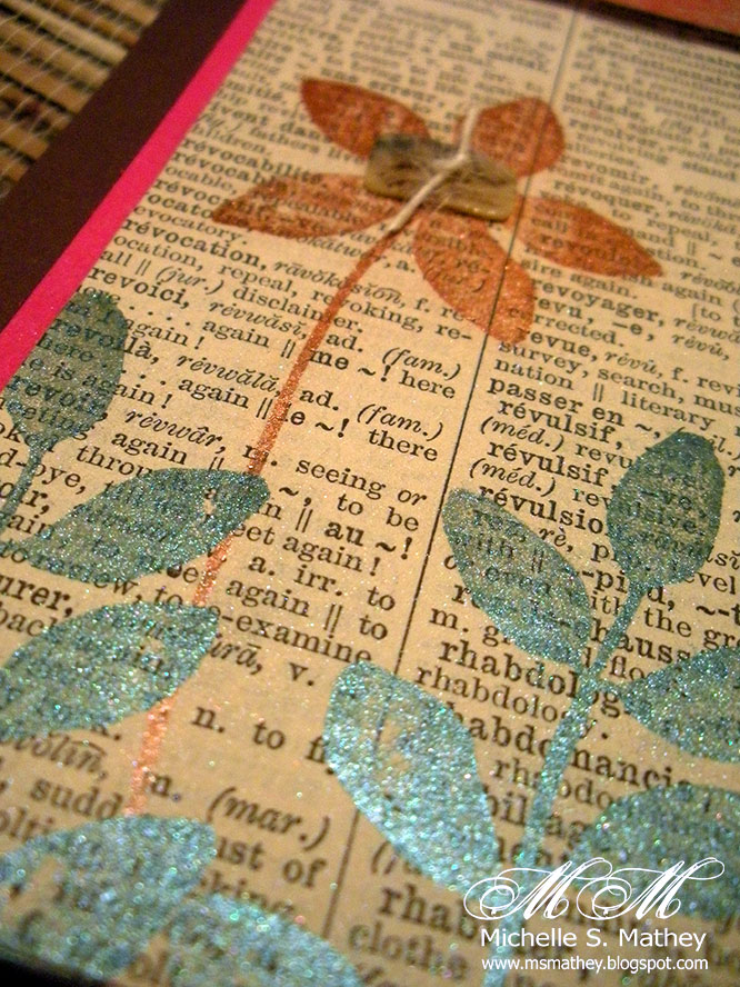
Patterned paper by American Crafts; Woodcut by KaiserCrafts, Die by Papertrey Ink, Zva Crystals, sentiment by A Muse.

Saturday, October 2, 2010

World Card Making Day!!

It is World Card Making Day!!  I could not/would not let this day pass without making a card no matter how busy things are around here!!  This layout came from Clean and Simple Stamping's FTL110
The colors were inspired by the Play Date Cafe Challenge (PDCC49).  Even though hot pink is not one of my favorite colors I managed to get it on the card (can you believe how garish even a teeny bit of pink can be?)  The stamped flowers and leaves came from a SU! set called Wonderful You - colored with Perfect Pearls - from an angle you can see how pretty the turquoise leaves turned out.  Sentiment is from A Muse.
Hope you took some time to play with paper today!!